
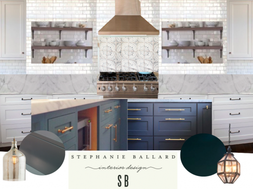
You guys did us SUCH a solid weighing in last week on Karrie’s new kitchen! THANK you!!! We loved hearing from all of you and we’re down to some combo of what was #1 and #2, with the only major decision left to be made being the ISLAND COLOR. First of all, here’s what one side of the kitchen technically will look like (island is in front of it but not pictured in this elevation):

SEH. Here’s where we stand:
- Cabinets: We’re going WHITE on all perimeter cabinetry.
- Countertops: Carrara-like (Quartz TBD).
- Backsplash: Classic white subway tile (with a light-to-medium grey grout) as the backsplash and alllllllll the way up the range wall and also all the way up the wall around the kitchen sink (not pictured).
- Inset over Range: Tabarka Nord.
- Open shelving: flanking the range (rustic finish, either floating or on oil rubbed bronze brackets).
- Island: EHHHMAHGAH WE CAN’T DECIDE!!! What do y’all think? Karrie’s first instinct is navy. Or more specifically, Farrow & Ball’s Hague Blue… Which I love for being so gorgeous and classic. But which I do not love for being vomited all over the Pinterestphere in the last year or two. But DANG it’s pretty:
- My first instinct is to go just a little bit outside of the box and do more of a Peacock Blue. I pulled an old inspo photo out of the archives of my dome that Melissa Bixby Anderson (of Bixby & Ball and now Perennials fame) did a few years ago (cabinets by San Diego Custom Cabinets – heeeeeeeey… ps did I tell you I do kitchens/baths for them now?) – but for real – THIS kitchen… I have been dying over it ever since:
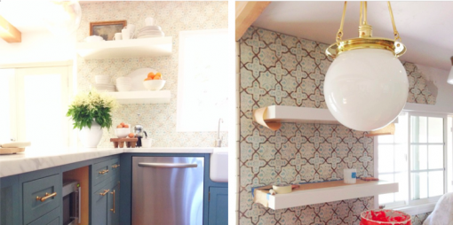
Melissa – who btw is one of the sweetest and most talented people, ever – said something to me about that kitchen that stuck like glue: that that particular client was a really fun family with a ton of personality in the throes of trying to decide whether to go classic all-white, or go kinda fun and crazy… obviously they went the route that was truer to their family dynamic, and so every time I think about Karrie’s kitchen, I really want it to be her, personified. Ya know?
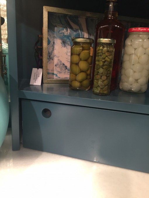
The kitchen above was what planted the seed, but the inside of this gorgeous bar cabinet by Kristen Buckingham for Global Views that I saw over the weekend at Vegas market tipped the scales for me. BECAUSE IT WAS THE MOST PERFECT SHADE OF PEACOCK I EVER SAW:
PS there’s my buddy and bad a$$ designer Hope (of Hope Pinc Design). Hey girl heeeeey!
Anyhow – we’re on the fence (again). Wanna help? Here’s a doodle in po-man’s-photoshop (Microsoft Word) I just flipped to Karrie real fast… What’ll it be peeps – VEGAS PEACOCK or NAVY?!
xoxo!

PS: Sorry to you Bach Fans about no post this week. I blame being at 10,000 feet + a jam-packed schedule 🙂 Be back next week, honest!


I like the peacock
I’m leaning toward the peacock, so pretty!
Love the blue if you’re using it for the island! the whole room is such a great look!
navy! Classic color that will never be dated. And with gold hardware it is to die!
As Vince Vaughn said to Jon Favreau in Swingers: “Vegas, baby!”
Both are fantastic selections. I’ve completed the navy and white combos in a few kitchens this past year. So classic and beautiful. Only one with the gold accessories(which rocked) also one in oil bronze and a polished nickel. I know you aren’t scared of taking risks when designing so if you feel your friend won’t tire of the Vegas peacock in 5+ plus years go for it!
Can’t wait to see the finished product.
Mitch
P. S. – My website is under construction which is dumb because this would have been great marketing. Ugh!
Have I told you yet how lucky I am that YOU’RE my interior designer? Mmkay, well I am 😀 Love you long time!!!!!!!!!!!!
Love the Peacock!!!
peacock
Is there any hint of blue in the Tabarka Nord inset tile? They won’t be next to each other but still need to play nice together. If the tile looks good with both, I vote peacock!
Immediately after voting for Peacock in my earlier comment I stumbled across this gooorgeous kitchen on House of Turquoise. It’s so fun and versatile. Peacock all the way!
http://www.houseofturquoise.com/2016/01/sabrina-alfin-interiors.html