When it comes to design trends, I’ll say this before I say anything else: you should always do what you love, because what you love never goes out of style. So if you love any of the stuff on this list – go ‘head and do yo thing. But, while we’re on the subject of trends, here are my two cents on what I might poke myself in the eyeballs if I see much more of, cuz nothing chaps my hide more than trendy business.
It’s not so much that these things have become so, so overplayed that they’re like a bad Sugar Ray song you can’t get out of your head that makes your ears bleed; it’s more that I look at everything in your home as an investment, so I think the idea of having to recycle your decor every time the trend tides change is asinine, expensive, and exhausting. You heard it here kids: invest ONLY in the things you love that are timeless, and leave this stuff behind.
1. GREY EVERYTHING: Ugh. Every time I look at new construction or a house someone is flipping, the whole DA*N thing is grey. ALL OF IT. Guys, I promise we can be more creative than that. I have one client who – though I love her dearly – undoubtedly says to me on every single design decision: “You know what, I was thinking about something grey.” (………….)

Ho LAWD! Besides being beaten like a dead horse times infinity, the thing about grey – especially when it comes to paint – is that there are 9 kablillion shades of it, so it can be tough to get it right – more often than not, it comes out too cold and lifeless. Comme ça:
The idea that the grey curtains have to match the grey drapes and the grey upholstery and the grey walls *legit* makes my innards curdle. You know what I mean – you’ve seen it before:
I’m not saying let’s abandon grey altogether. But fer heavens sakes, let’s stop using it as a default for EVERYTHING. And if you’re painting walls or cabinets with it, make sure you do LOTS of samples on a wall – or have your cabinet guy make you a sample door – because nothing ever looks the same on a paint chip as it does on the wall or cabinet, and then factor in your light in your house, etc. The same color you just saw look great in Sallie Jane’s house on Pinterest may completely different in your house.
I think when grey is done right (and in healthy doses), it can be an amazing neutral to keep in your arsenal. Some of my faves are colors like Farrow & Ball Down Pipe – which is a dark, rich grey with so much depth that the color is almost indiscernible.. sometimes it looks grey, sometimes green, sometimes blue.
source unknown but bravo – it’s beautiful!
via F&B’s website – I commend the wall color, but I object to the chevron (!) see #2
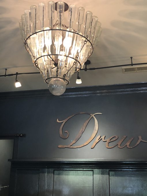
Not sure what this grey is, but I took this pic at the Drew Tasting Room near St. Helena in Northern Cali a few weeks ago. Stunning. It looks like Sherwin Williams Urbane Bronze.
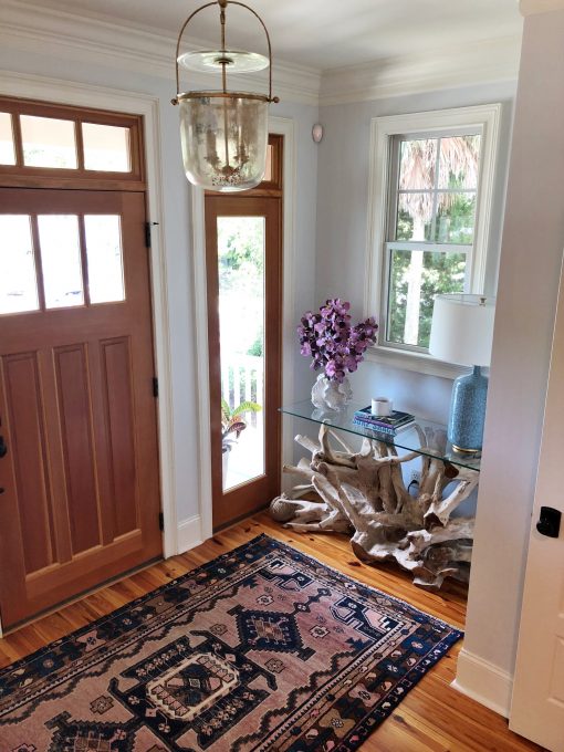
On the lighter side, I also love Dunn Edwards’ Lace Veil – it’s the palest neutral with a barely-there blue undertone. I used it as the all-over downstairs color at my Charleston beach house project earlier this year:
Another few examples of the palest grey done right: Jenna Lyons did it on her walls (the woman can’t get it wrong) – and IMO, this grey has a good bit of blue in it that gives it some life, and there’s also so much beautiful texture (the sheepskin chairs, the buttery leather), warmth (the brass tones) and color (the coral sofas, everything on the bookshelves) layered into the space that makes it work beautifully.
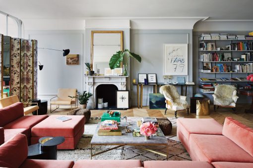
photo via New York Times
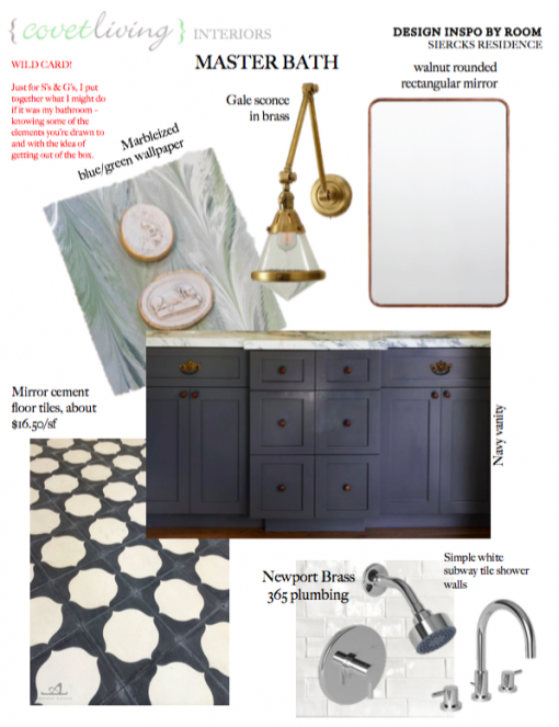
And not to be a ho, but this is a kitchen I finished in Downers Grove, IL this Summer. We didn’t want to do white cabinets, but wanted something classic and timeless with a little bit of pigment. We did the palest grey-blue, and it came out super serene and lovely. Design by Covet Living Interiors, Photo by Oakley Homebuilders.
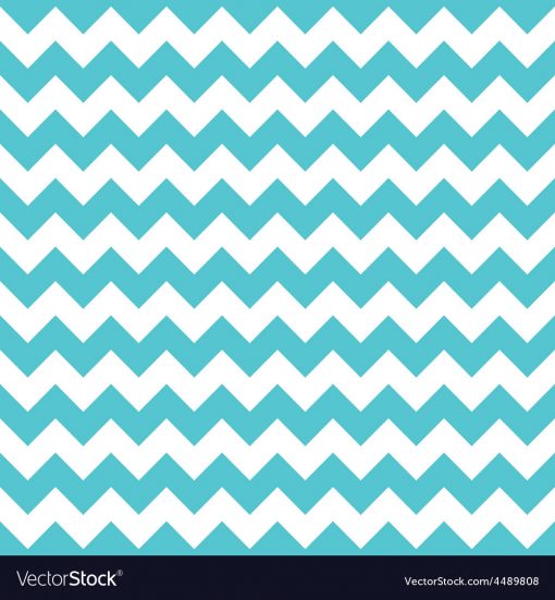
2. CHEVRON: The lights went out at this party around 2007. You heard it here. I’m silently screaming “Uncle.” Forgive me, my chevron-loving friends, but if your BFF blogger can’t shootchoo straight, who will?
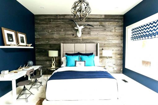
3. ACCENT WALLS: sorry, but accent walls are the design equivalent of wearing a dickie, and that is a fact.

I think the rationale for doing them is probably that they’re less committal, or that maybe if you’re using wallpaper or reclaimed wood (please no more reclaimed wood walls, for the love of pete), it’s less of an investment, etc… but whenever I see them, all I can think about is a dickie. The space always feels disjointed or unfinished to me. Like this… plus chevron = double whammy.
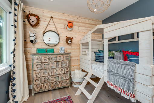
Hey listen… I did one last year for a kid’s room. But only because the client twisted my arm so many times it fell off and I screamed MERRSAYYYYY!
I say when it comes to wallpaper – go ‘head and go big (or go home). I’m sure I’ve seen an accent wall at some point that was rad, but I can’t recall… though it was probably inside some molding or in a recessed arched nook or something – and therein lies my exception to the rule.
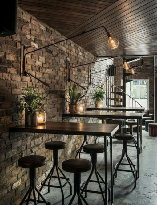
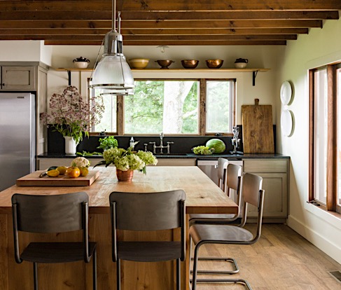
4. INDUSTRIAL EVERYTHING: This is one I feel like dudes-the-world-over think is still the best thing since sliced bread and aren’t gonna let go of for at LEAST a few more years (*COUGH* Chris… love you babe):
Reclaimed wood accent walls (or just reclaimed wood everything) + Edison bulbs + shelves made of steel pipes + everything made of steel pipes + leather on all the things + white subway tile with black grout + all furniture made with a metal pipe base and wood top – that’s the combo I mean. And it is a BIG formula in Colorado.
I am pointing my finger at Restoration Hardware right now for contributing to this long-past-its-sour-milk date… see me? Individually some of those elements are great peppered into a space, I think… (I’m over Edisons but still def not over exposed bulbs)… I love me some leather but not on all the things.
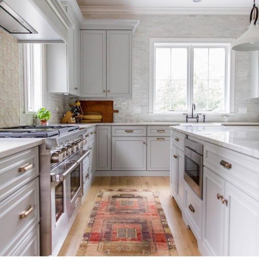
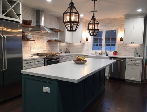
PS: white tile with black grout = never a good idea, unless maybe you run a Starbucks or own a restaurant. It just feels so harsh. If you’re worried about grime, just do medium to light grey – Laticrete’s Light Pewter is a fave (seen below in Karrie’s kitchen), and you can see it’s not “light” at all. But still much softer than a stark black.

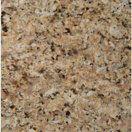
5. GRANITE: oh man. Such a rager in the late 90’s and early 2000’s, and I’m voting for it to stay right there where it belongs. This speckly natural stone was, I swear, boasted in every real estate ad 15-20 years ago like it was mined from the heavens above, blessed by the Pope and sealed with unicorn tears. Most types of granite these days I come across in slab yards are either black & white or brown & well – brown. Mehrr. Blehhhr.
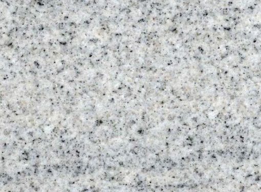
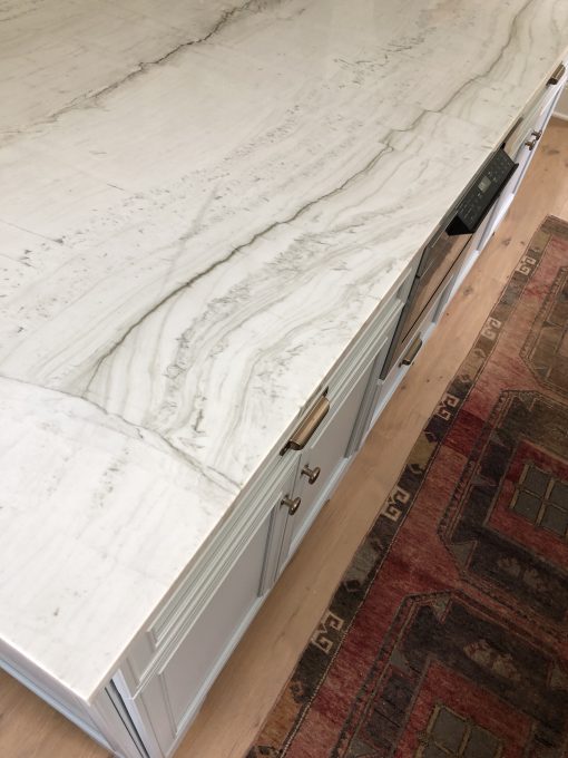
If I ever ran across one that was a little more unique with different movement than just salt & peppa speckles – and one that didn’t feel like it belonged in a Tuscan kitchen in 1998, then I would consider it. There are for sure some anomalies out there. But in general, natural stone like quartzite is stronger and more chip-resistant than granite (and also has more linear movement), also less resistant to stains (so folks with kiddos love it) and I think has a great deal more staying power. This quartzite beaut below is also in the kitchen of my sweet DG friend whose house we had a ball doing.
So anyhoosit – if we were holding hands & skipping through the slab yard singing songs, just know that I would make sure we blew straight past the granite aisle altogether. If you’re flipping a house or thinking about selling one anytime in the near future, I can confidently tell you that granite countertops are not gonna be your friend. Trust me on this one, campers.
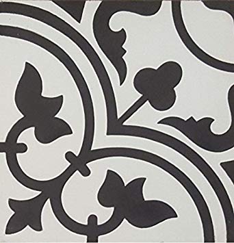
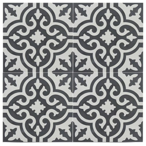
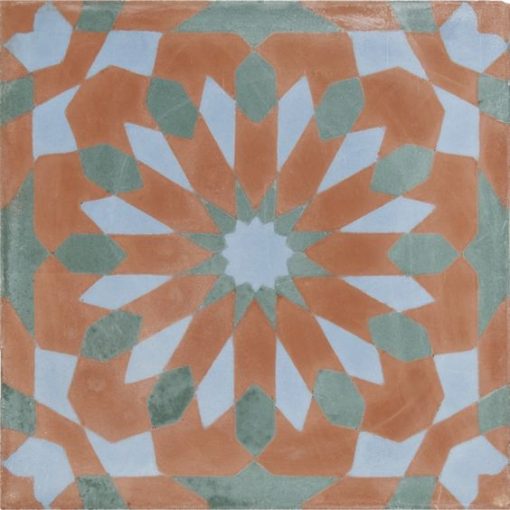
6. (THESE) BLACK & WHITE CEMENT TILES: Oh I know, I just heard an audible gasp and lost 12 friends. There’s so much of it out there that’s great and that I love and use all the time: the more unique patterns that are either antique, in unexpected colors or just ones that we all haven’t seen done more times than ever-loving Debbie Does Dallas (henceforth known as D-cubed). But there is SO MUCH OF IT that has become so homogenized on the Interwebs that I tend to steer clear. For instance, I would move past patterns like this, because I guarantee they’re in every. single. remodel that’s gone down in the last 2 years and have become way commoditized:
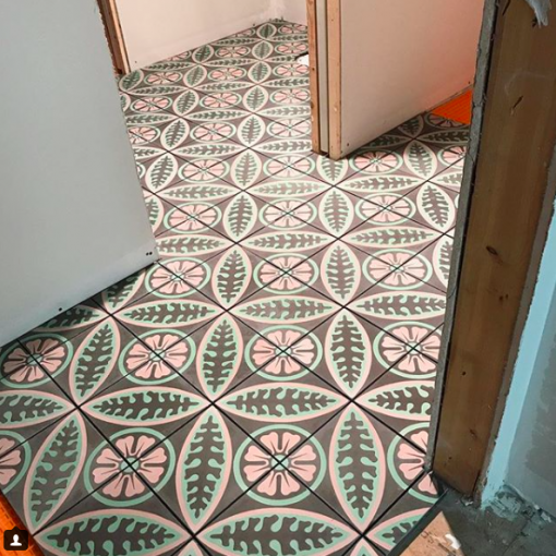
However, I think there’s a difference between the mass-market ones we can’t get away from, and the ones that look like you would see them on a bedroom floor in a B&B in Mexico or Morocco, that have been there for 50 years and are still so beautiful. And cement tile is great for its durability, pop of fun, relatively reasonable cost (about $15 / SF on average) and because most of them are 8×8, tile setters don’t hate kick and scream while they’re laying it. So if you’re in the market for cement tile, I would consider ones like this:
From a project last year in the Jack & Jill bath of a few little gals. This color palette of dusty rose, mint and mint chocolate is happy and so delicious I can’t take it. This one feels timeless to me.
This one from Jatana Interiors has me weak at the knees.
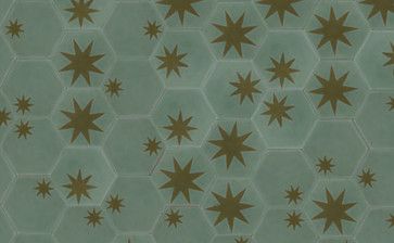
The Hex Star from Popham Design is so beautiful! The hex shape, the random pattern of the stars, and the sage & celadon color palette of this one is so unexpected and interesting.
Mamounia in Santorini from Ann Sacks is so bomb.
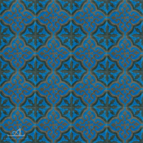
Love the Medallion Sapphire from Amethyst Artisan.
Their Mirror pattern I’m currently using in a big renovation – it feels kind of old world and kind of mod to me at the same time.
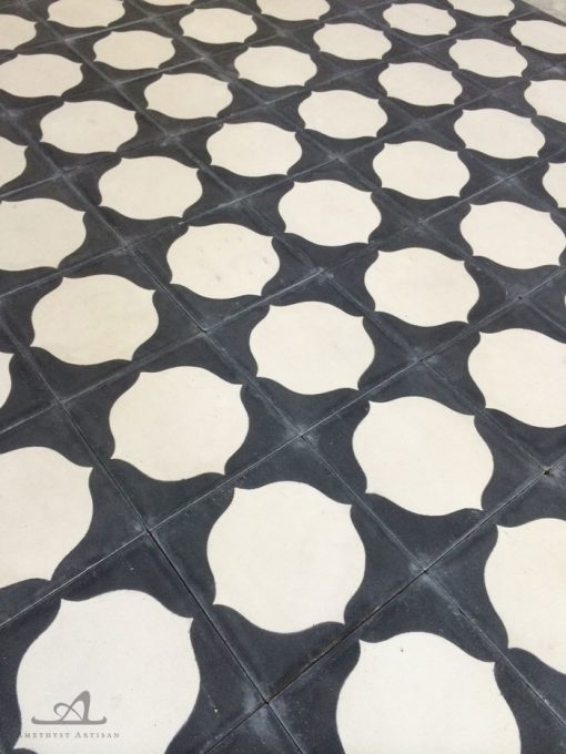
…and would be SUPER RAD with this marbelized wallpaper (though that’s not how we’re using it in this space). But the juxtaposition of those patterns is what keeps it all feeling fresh.
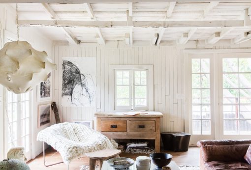
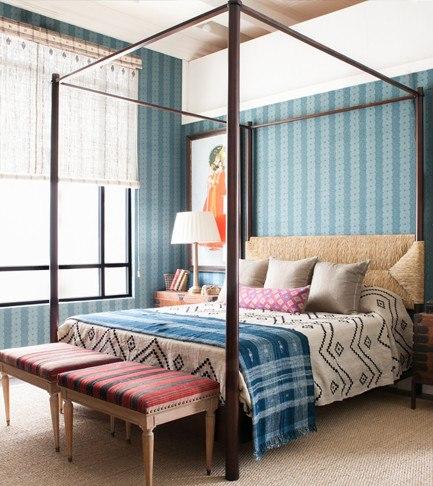
7. FARMHOUSE RUN AMUCK: And listen – I love me some Chip & Jo. I love me some country chic sprinkled in a home, à la quilts and Shabby Chic and worn textiles and such. Always will – Nanny & GG & Aunt Bunky always quilted and I love furniture with a patina and such. What I’m talking about is the copycat regurgitation of evvvvvverything from Fixer Upper: the overkill of “Fresh Eggs” signs and wire cage pendant lights and quatrefoil rugs and (not antique, but) chalk painted then sanded to look old furniture. And thank you to Kate Wagner, the hilarious soul who wrote: “I Really Can’t With These Pinterest Farmhouse Ideas” for Architectural Digest.
I think the country, farmhouse/rustic vibe works best when it’s more authentic, and interspersed with some juxtaposed elements to keep it real. AKA mixing styles so it doesn’t feel so one-note. Designers Leanne Ford and Lauren Leiss are – I think – both BRILLIANT at this. À la:
Nate Berkus too:
While we’re on the subject, a few of my favorite furniture pieces (EVER) are ones that straddle antique & modern:
Straight farmhouse / country but all authentic and so well-loved and worn:
Moral of the story: if you’re into the farmhouse / country vibe, invest in antiques instead of the chalk-painted dime-a-dozen replicas (and hey – some of my best antiques ever have been under $50 from Goodwill or Habitat for Humanity), steer clear of signs that tell you to do what you already know you’re meant to do in each room, e.g. “BREAKFAST SERVED HERE!” (cuz trust me, we get it), and layer in some clean-lined pieces to keep the space feeling fresh.
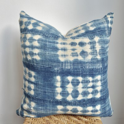
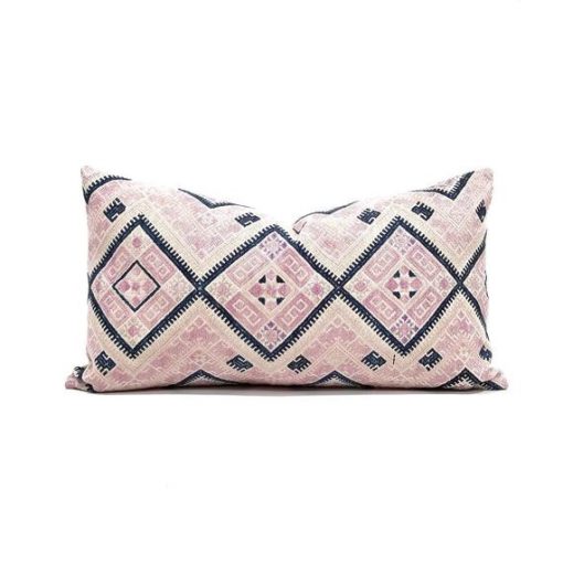
8. INDIGO & MUDCLOTH: I know, I know. They’re pretty and they feel cool and tribal and SoCal-esque and they’ve been EVERYWHERE for the past few years. Replayed so many times on Instagram I can’t count and I think my eyes hurt. I still like them, but they’re getting to be like my girl D-cubed.
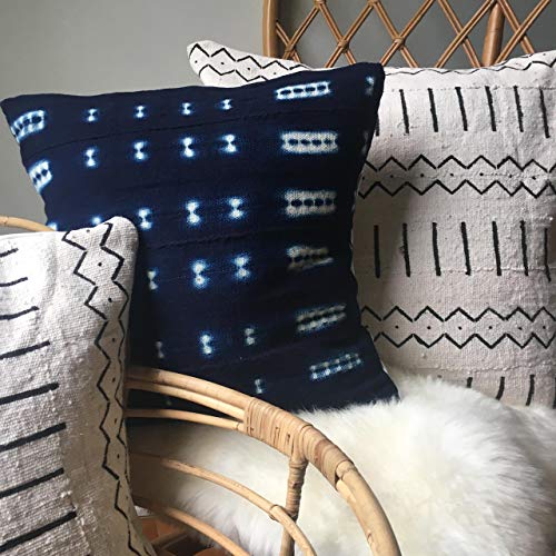
I’m not saying send them to Goodwill, but I am saying LET’S MIX IT UP PEOPLE! If you still love that look, try for a fresh spin on it – or just use a color/pattern that isn’t so overdone. I love these below:
Hollywood at Home never gets it wrong. This bedroom (with what looks like a mudcloth coverlet) works because all of the patterns are so artfully layered.
Should we play a drinking game and see how many times I can say “layer” or “patina” or “timeless” in one post? We’d all be housed by now. Just letting you know I’m self-aware.
This Indigo Mudcloth African Boho is in a more faded color – which is a little more unique – and I haven’t seen this pattern circulate as much:
And when you use it, maybe toss it in with other patterns & colors that are a different texture, and maybe that aren’t vintage… like this velvet pattern from Kravet:
Or, opt for another (albeit harder to come by) ethnic textile on a pillow or two, like one made from a Chinese Wedding Blanket:
9. THE NOTION THAT ALL YOUR METALS HAVE TO MATCH: Dude, rules are meant to be broken, and this is one that makes me want to pull my hair out…. (and pretty sure I did just that last year on the boob tube). I just had the lady down the street from my aunt – who I’m helping with her kitchen – insist that she needed brushed nickel cabinet hardware b/c you “have to match it to your stainless steel sink.” Oh sugar, sit down.
When everything in a space matches – whether it be hardware or a set of furniture, whatever – it tends to end up feeling flat and looking contrived. I promise, PROMISE promise – if you’re feeling nervous about mixing things up – you have my blessing. Do it. Layering materials, textures and patterns in a space is what gives it depth and character. Examples:
No idea what the source of this is, but note the gilded mirror, brass coffee table and the chrome frame on the chairs. It all works. LAYAHS.
This is a custom fridge I did this year at a kitchen remodel in Las Vegas. We used antique mirror on the panels (which was heavily distressed, which helped tie some of the warmer & cooler metals in the space together)… cabinet pulls are all Rocky Mountain Hardware’s “Silicon Bronze Light” – which is a brassy/bronze tone but almost looks nickel in some lights, and the handles on the fridge are a darker bronze – still Rocky’s – because especially due to their size, we wanted them to be more discreet and “go away” against the walnut.
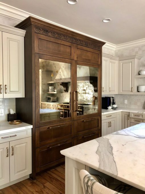
La Cornue knobs are a brighter brass that patinas over time, so it works nicely with everything else.
Kids Bath Mixation:
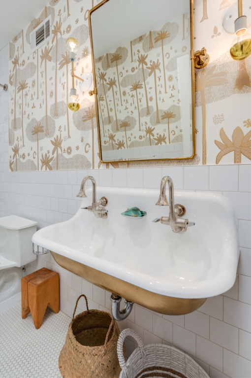
Antique Mirror + brass & lucite hardware + polished nickel plumbing, and it works:
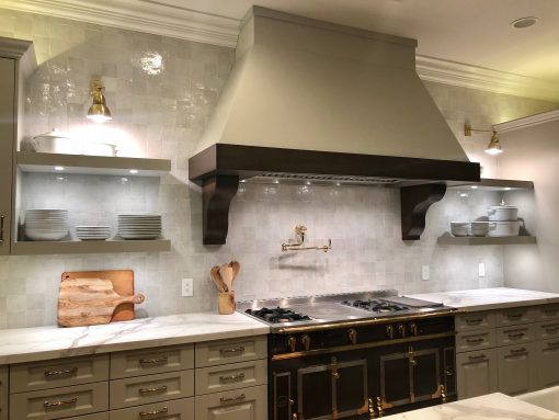
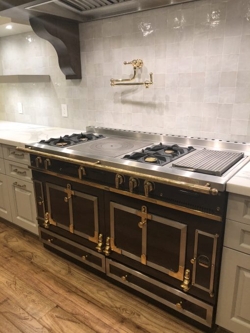
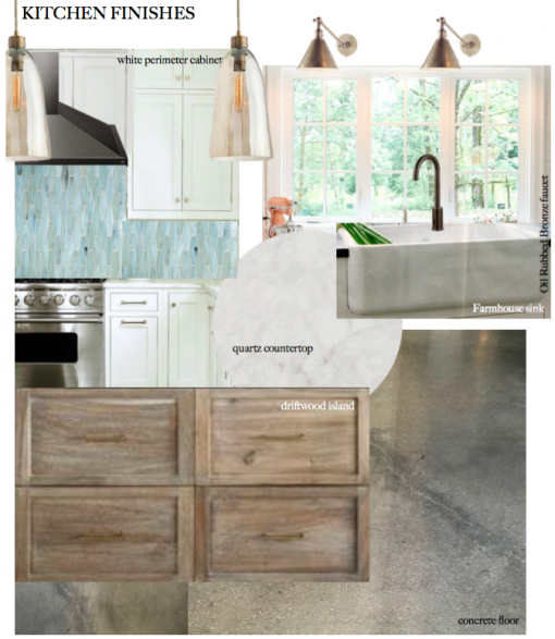
We also mixed metals in Karrie’s kitchen (#casacovetliving) pretty successfully, if you ask me: kitchen light fixtures and perimeter hardware is oil rubbed bronze / black. Hardware on the island and the dining chandelier in adjacent nook are brass. Still my favorite kitchen to date – and I think that’s because when we did it, we were OBSESSIVE about making sure it was cohesive but didn’t adhere to any one design style, and was something they would love for a very, very long time.
A few more quick notes on metals:
- If you’re choosing between chrome and polished nickel, go polished nickel – it has more depth and a little more warmth than chrome, so it mixes well with other metals. Chrome is typically a little less spendy, but it also can feel cold.
- When it comes to brushed nickel – which feels a bit passé / 90’s – I would like to cheerfully encourage you to also entertain pewter as an option. It’s somewhere between a darker nickel and a bronze, which makes it a good mixer-upper. I just used it on the cabinetry in a coastal kitchen in Oceanside, CA where they had black stainless steel appliances, ORB plumbing fixtures and sconces in antique nickel, so pewter felt like it married everything below together in the end without competing with what was there.
- I know brass is all the rage – and believe me, I love it – but know that NOT ALL BRASSES ARE CREATED EQUAL. You can find it online for a steal (as many of my clients do, then tell me I’m insane and that it’s not that expensive), but if it seems too good to be true, it probably is. Seeing it in person before you buy it is imperative. A lot of it looks green or yellow – like Donald Trump’s gold toilet kind of yellow-gold – and that you won’t want. A great way to add metal in to your designs is through the linings of your windows and doors. If you’re looking for a great company that could help you with your doors, check out these amazing door replacement companies near me.
10. DISPOSABLE DESIGN: I don’t know if this is a “design trend” so much as a pattern of behavior I see in people these days, but it’s the frantic rush to furnish a room on the cheap or do a remodel in a day, just for the sake of getting it done. I blame Trading Spaces 🙂 j/k TLC, hearts & stars. One of my major design philosophies is that “haste makes waste“… cuz it’s true. Examples:
- I had a (beloved client) demo her house last Winter BEFORE OUR DESIGN PLANS WERE DONE! Because the goofball of a contractor promised her the moon – that he could finish her gut reno in 6 weeks. That fella obviously had smoked dank for breakfast every single day of his life. What followed was 6 months of trying to undo his expectations and convince them to wait for the kinds of things we really wanted to put into the house. Finding things without a lead time is tall order unless you want to buy pre-fab everything off the shelf, and this was NOT a pre-fab sort of job. These wonderful, wonderful people had saved for for ages and wanted to do it right. By the grace of Jesus, Buddha and Santy Claus all put together plus a few strokes of good luck, everything ended up turning out beautifully… but I think I did develop an ulcer in February, and those poor folks (who lived in the house and in the converted garage for 5 months of the reno) probably developed 12 over the course of that job.
- I actually got politely relieved of a job the other day 2 weeks after the initial measure / consult (before I had a chance to present options) because they got antsy and just wanted to do it themselves (and because some major retailer was having a sale). Totally respect their decision – different strokes – but that’s the rush-rush need to finish before we start phenomenon I’m referring to.
Here’s the thing: I think grew up in a place where – don’t get me wrong, we were fine, we had everything we needed, and I never would’ve wanted to grow up another way – but nothing was fancy. It was a cozy world of linoleum and carpet, and I couldn’t have been happier. I’m pretty sure my parents still have all the furniture they had when I was a kid. So while I do a lot of high-end design, most people I know – including me and the people in my family – MAY go big time and renovate/build or furnish a house once in a lifetime, if that. So to me, that makes it all the more important to do things thoughtfully – to make sure they’re what you love and to make sure they’ll stand the test of time – because I feel like some things in a home have such a sense of permanence.
I shudder to see clients (even the ones who can afford it) spend money on anything they won’t have for a long, long time… and am obnoxious about cautioning them against it. It’s this school of thought: “well, I’m gonna just spend $5k in this room now and get it done and let my kids destroy everything, then replace it all in a few years.” But the thing is, while you may end up saving in the short term, YOU END UP SPENDING THE MONEY TWICE WHEN YOU REPLACE EVERYTHING AFTER A FEW SEASONS, when you could’ve spent 30% more on the right thing in the first place and been done with it. How’s the old saying go? “When you buy the right thing, you only cry once.”
For this same reason, I will literally clothesline someone jones-ing to do anything too trendy, because in 6 months I know they’ll be sick of it and want to do it over again. I feel like if I don’t push for timeless and help them spend their money wisely, I’m not doing a good job doing my job.
My home skillet Nate Berkus, who neither adheres to nor pays attention to trends, said the same thing: “It’s more about what feels classic; just do what do you love.”
Because as we all know – anything you really love never goes out of style.
xoxo,