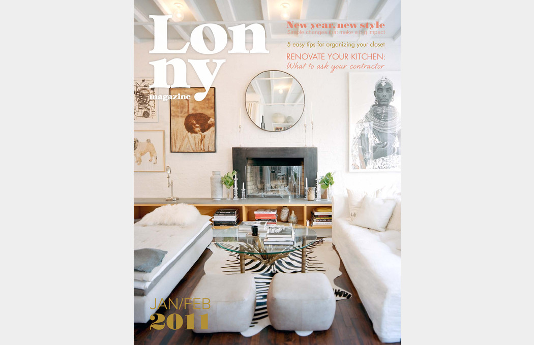
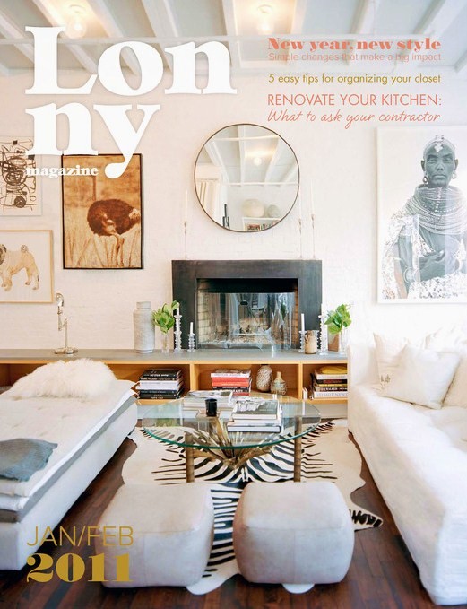
The Jan/Feb 2011 issue of Lonny hit the web yesterday and – like any fervent bloggers would – we clicked the link and anxiously awaited the sparkly new issue to load. If you’re chomping at the bit but don’t have enough downtime today to devour the whole thing cover-to-cover, fear not. We made you a snack!

1. “Everyday I Love You” Wafer Notebook. Imagine a sweet, loving boyfriend giving this to you as a present. I could die.
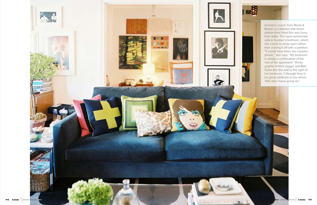
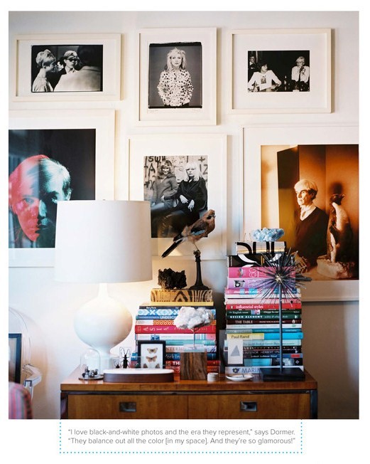
 2. West Elm Style Manager Angel Dormer’s House… 1st, the Living Room. A recurring project I’ve assigned myself for each apartment over the years – yet never completed – is a wall with great black and white photos.
Also lovin’ her Warhol shots.
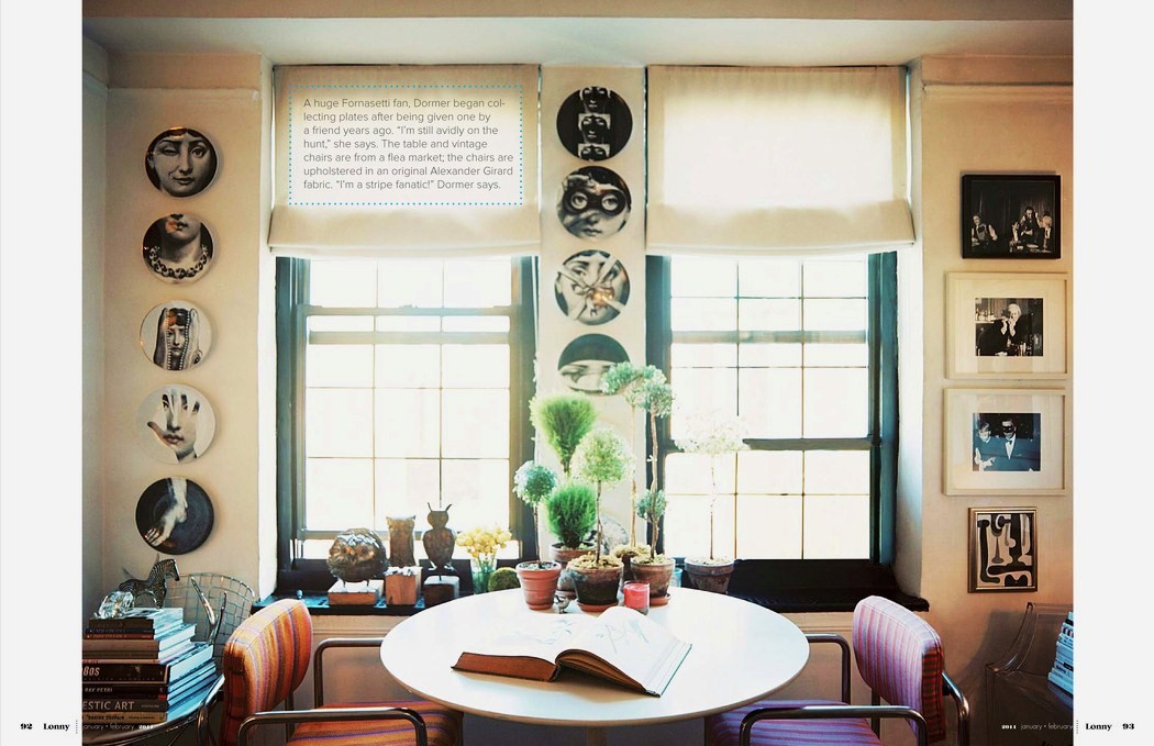
 2nd, check out her cozy little breakfast nook. I just could sit in here and read a book for hours! Earthy, cozy and bright. And as former Muncie Burris Owl cheerleaders, we love the owls perched in the window sill. Cute cute cute.
3. Wishbone Charm Necklace on Chain. Reminds me of sweet memories around the holidays when my mom and I get into a knock-down-drag-out fight over the wishbone. Oh, Tina.
 4. Must. Have. This. Wall. Paint. Somewhere. (Benjamin Moore Calypso Blue). The painting transports me to a calm place; the starfish is an adorable and well-placed accessory.

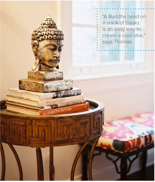
5. Buddah Head in Hillary Thomas’ House. How can something as simple as a buddha head have such an impact on a part of the room? But that’s the thing… it can. So calming, so zen. Yet funky and cool. I’m about to head right on over to the nearest bazaar and pick up one of these puppies. I’ll place it on a little coffee table and voila, I’ve got my Zen corner.
 6. THIS Marc Jacobs dress. It’s totally sweet, painfully chic, and positively flawless. Perhaps I’ll wear it the next time I have tea & crumpets with the Queen.
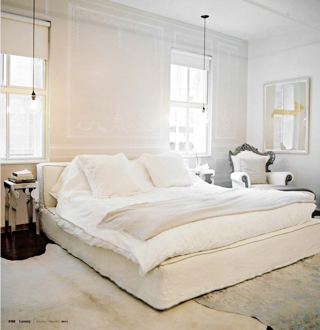
 7. The simple luxury of Jerlath Mellett’s all-white bedroom. It is PERFECTION. The layers of rugs and bedding… the pendants hanging over the nightstands… the pop of sunny yellow on the wall. This room deserves – and shall receive – its very own post.
8. Color everywhere you look – especially that Lilly Pulitzer feature…
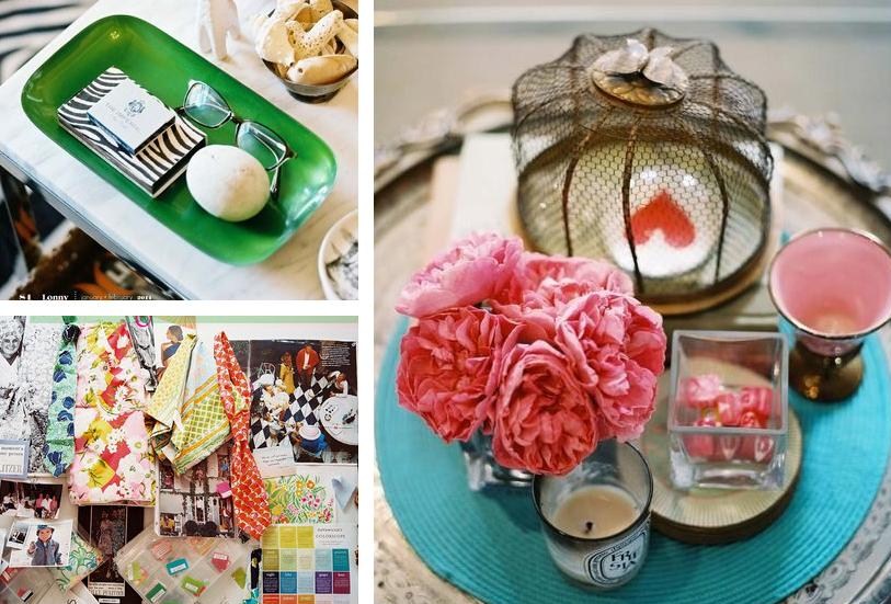
…And all those easy breezy outdoor shots that make me feel like I can breathe again. Ahhhhhhh. Is it springtime yet?

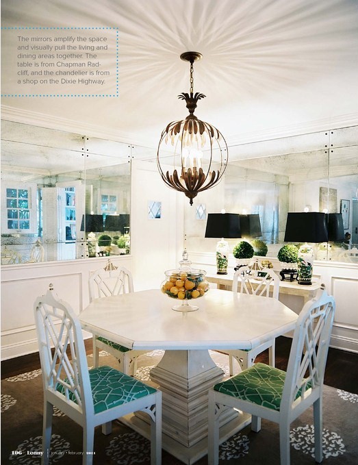
9. The way this insanely cool chandelier is reflecting on the ceiling in Designer Hillary Thomas’ dining room. And those MIRRORS (!)
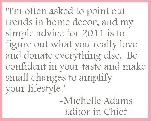
10. This excerpt from Michelle Adams’ Editor’s Letter. If I didn’t already think she was a cool chick after I saw her apartment, now I’m certain she’s the kind of girl you want to be friends with. You know she has to be a rock star in real life because the woman – together with co-founder Patrick Cline – built this little online magazine on her back, which has catapulted to design superstardom… yet she still seems as humble, gracious and sweet as your best girlfriend. Plus, instead of shoving 19 new trends for 2011 down our throat, she encouraged us to keep it real and decorate with what makes us happy. We adore her.
Amen sistah,