I’m not sure if it’s the new beige or the new black, and in fact, it’s not really “new” at all, but greige (grey + beige) is everywhere you look, and it seems to be everyone’s favorite new hue these days. It’s that soothing neutral that comes in a slew of shades from dreary to dreamy. And since it can come off a smidge modern, it looks great against time-worn pieces, rustic wood and warm metals. That juxtaposition keeps it from looking austere and I, for one, am smitten. Especially this week, since the weather in Columbus is so awesome (remind me to go write: “I love overcast & sleet in March” 400x on the blackboard). But whatever the case, I wanted to share some of my favorite spaces drenched in the moody hue:
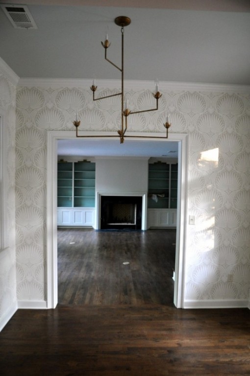
RACHEL HALVORSON | Dining Room
I honestly think a little pee came out when I saw this on Simply Smitten yesterday. That oh-so-soothing ceiling, against Farrow & Ball’s Lotus wallpaper… and I can’t even talk about that chandelier. The whole thing is perfection. Rachel Halvorson never ever disappoints. She only inspires all of us with her amazing interiors and even more amazing down-to-earth personality.
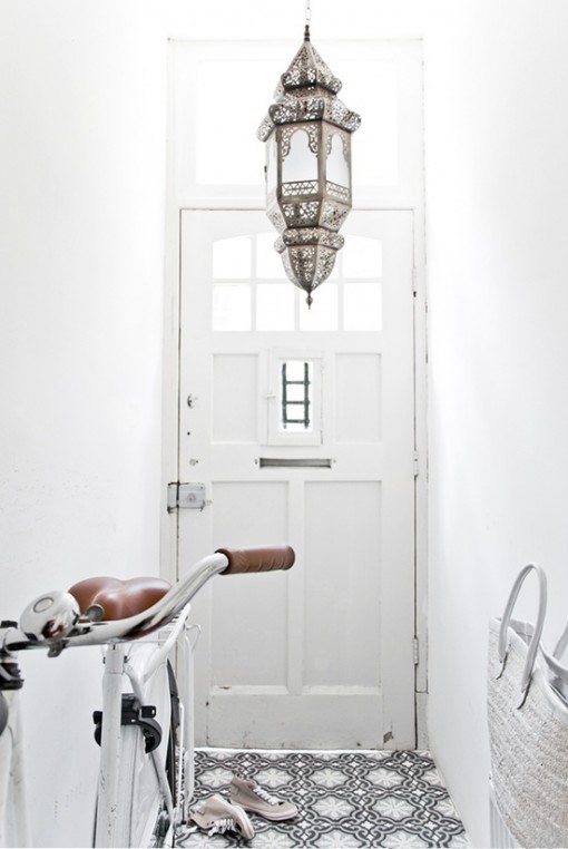
UNKNOWN | Entryway
The Moroccan lantern and the cement tile make this look like the entryway to heaven.
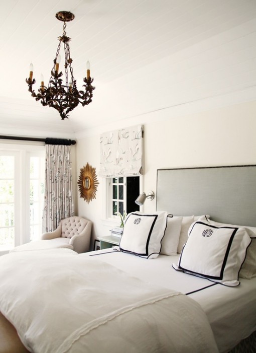
MARLIEN RENTMEESTER (of Lucky and LE CATCH fame) | Bedroom
This one is a forever favorite. I doubt I would’ve ever chosen that pelican brief birdie fabric, but it works perfectly in here and adds to the room’s serenity. The black (or is that navy?) in the monogrammed shams are a nice pop of contrast. As is that chandelier – baller. The nailhead headboard is perfectly simple, and the gold sunburst warms it all up. Also – did you notice the paneled ceiling? Adds character and warmth. Perfection.
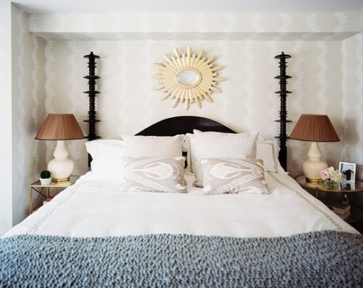
CELERIE KEMBLE | Bedroom
This reminds me of something I would want to do for my Mom’s room. There are a lot of pale neutrals and greys, but the (is that bone or bare wood?) mirror, pattern on the wallpaper, knit throw and chocolate-y lampshades keep the room warm & fuzzy. I think I’ll take my tea in here if you don’t mind, Mistah Carson.
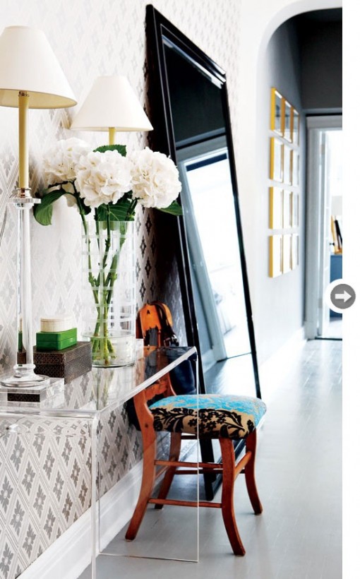
NICOLA MARK | Entryway
I don’t know that it would’ve occurred to me to purchase any of the items in this space on their own – except for maybe the lucite table – but together, they look outstanding. And that is precisely why people hire designers… because they have a sixth sense about these things. I gasped when I saw this room.
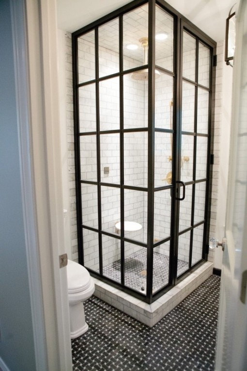
BAILEY McCARTHY | Bathroom
Uh, yum. The basketweave tile is beautiful. As is the Carrera Marble subway tile. Rest of the house re-do is here. And Bailey is the chick from Biscuit, that whimsical, pastelly-rainbow retail store in Houston, which I have been long-distance drooling over for months.
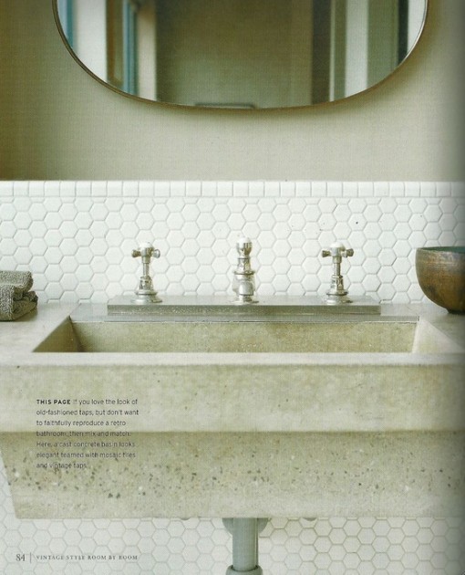
UNKNOWN | Bathroom
Give me that penny hex tile or give me death.
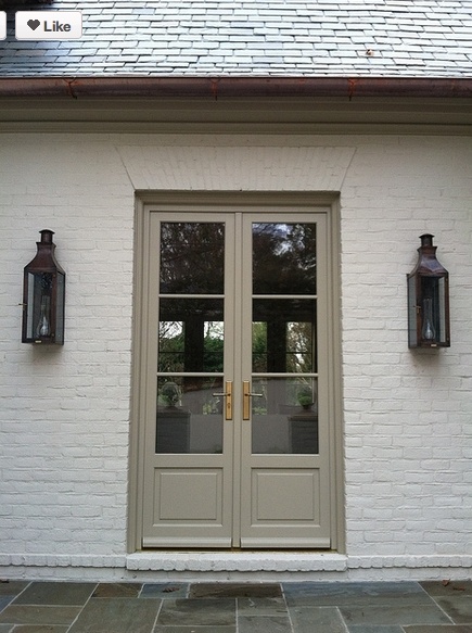
UNKNOWN | Entry Doors
I would be delighted to walk through this door every day. Love the whitewashed brick, rust lanterns and greige door. Benjamin Moore’s Texas Leather AC-3.
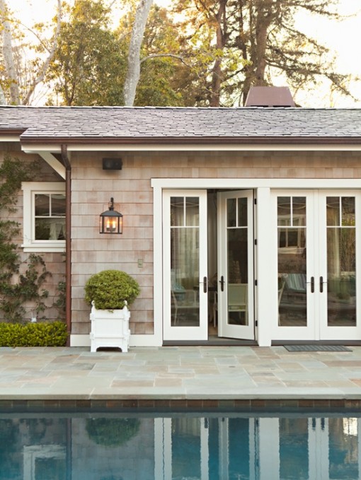
LEE ANN THORNTON | Poolhouse
How tranquil is this?? Yes please.
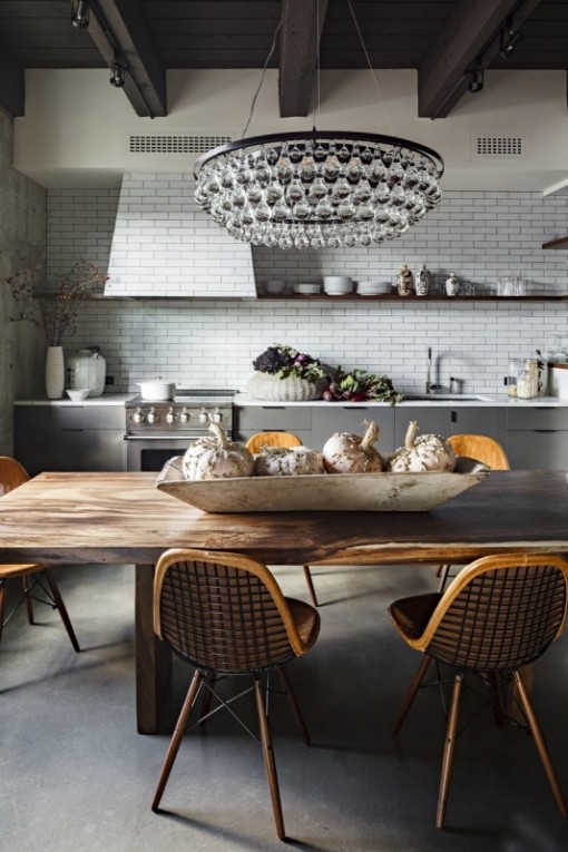
JESSICA HELGERSON | Formal Kitchen
Sigh. Rustic + formal in one room. Michelle Slatalla wrote a pretty right-on article about how dining rooms are a dying breed, and quickly being replaced by “formal kitchens.” I kinda couldn’t agree more, and neither could my dining room, which is like one giant junk drawer. It’s where all scrap paper, mail, and dirty clothes go to die.
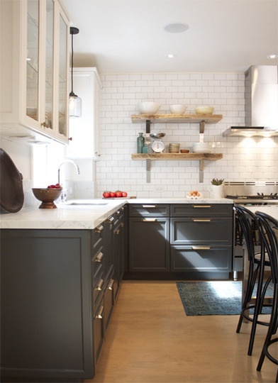
UNKNOWN | as seen on A Perfect Gray
This is a good little blog about all things gray if you haven’t read it yet. Donna’s got lotsa good recs for paint colors, too.
It seems to me the key to using greige in a way that doesn’t come off as frosty is to pair it with warm elements… like antiqued brass chandeliers à la Rachel Halvorson or antiqued brass hardware, rich hardwoods, milk chocolate lampshades à la Celerie Kemble, and accents in gold and rust-colored hues. It’s like Yin & Yang, yo. And when it comes to painting in shades of gray, I do know one thing: You can pin a thousand “The Perfect Gray!” pins on Pinterest, but when the rubber meets the road (or, before the paintbrush hits the wall), Sample, sample, sample. The subtleties are so so hard to eyeball on a paint swatch, and every color looks different in everyone’s house and in different lighting.
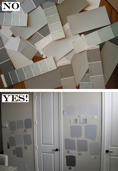
One place to start – Apartment Therapy recommends these bad boys: “Farrow & Ball’s Pavillion Grey | Stone 04 from Yolo Colorhouse. (It is greeny grey and lovely.) | Gray Owl from Benjamin Moore (A pretty true light grey) | Revere Pewter from Benjamin Moore (this one veers on taupe) | Stone Harbor from Benjamin Moore (that’s what’s in that last picture of our in process dining room)“. Sidenote: I just matched Revere Pewter to “Colonnade Grey” from Sherwin Williams last week. I’ll let you know how it turns out!
xoxo,
