House Beautiful

Archive for the 'Before and After' Category

Page 5 of 5

Steph’s Project: the Evanston Designer Showhouse

I was recently asked to do a room in a Designer Showhouse in Evanston, IL.  Neat-O, n’est-ce pas?!  For you non-Chicagoans, Evanston is an idyllic little suburb just north of the city and a hop, skip & a jump from where Jake Ryan once leaned up against his shiny red Porsche, ca. 1984, waiting for Samantha Baker.  To the tune of the Thompson Twins.  I only re-wound that scene about 857 times in high school.

This particular brick mansion (a National Historic Landmark) was built in 1914 by Ernest Mayo and is perched on a luscious, picturesque corner lot in said town.  Owner Janet Kohl – who currently resides in the home with her husband and 3 young boys – carefully and lovingly restored this once delapidated property a few years back.  Click here for pre-renovation pics.

What’s a Designer Showhouse, you ask?

A Designer Showhouse is like the home design equivalent of a fashion show.  It’s a project where a bunch of designers each pick a room in a house and redecorate it in their signature style…  Then, the showhouse is opened to the public for a few weeks, during which time visitors buy tickets to shuffle through and soak up some inspiration…  in the end, the designers get some business, the house gets a facelift, and the proceeds go to some very worthwhile charities (in this case, Designs for Dignity and the Citizens’ Lighthouse Community Land Trust of Evanston).  Good times, Amen.

I almost turned it down, given that my plate already overfloweth.  But in the end, the opportunity was too cool to pass up, so I jumped in and thought, yo.  I can totally figure this out.  Bring it.

Flash forward to 2 weeks ago, when I was under-the-gun, measuring out my floorplan to scale with a measuring tape I fished out of my sewing kit.  Yikes.  To be clear, I am not a card-carrying, official “designer.”  My background is in real estate; design-ing has always been the thing I do on the side.   I renovated my own home, have decorated homes for friends, and do some freelance work, but those projects have always developed organically.  This project is a horse of a different color.  Designer Nathan Thomas (Bravo’s Top Design Season 2 winner) said something in a recent interview that really resonated with me:

“I think designers are constantly thinking, rethinking, and second guessing their work looking for something better or different to make it their own and truly add their stamp to the project or design.”

Word to your mother, home slice.

Not wanting to bite off more than I could chew, I opted for the manageably-sized 2nd floor landing.  Here are some BEFORE pics:

AND, here are my hurdles:

Hurdle #1 – I initally had visions of sweet, funky little matching chairs & sugarplums dancing in my head, like these bad boys that the lovely Sam from StyleSWOON recently used.  But alas, there’s not enough depth anywhere for ’em.  Any furniture I put along the walls can only come out about 15″, otherwise someone will trip over it.

Hurdle #2 – The Rules:  No painting of the original woodwork, no faux finishes allowed, and all paint colors must coordinate with the owner’s existing decor and must be approved.  Artwork must be chosen from a select pool of sources, as the showhouse will have curator-style, docent-led tours.  We’ve also been instructed to drive as few nail holes into the old plaster walls as possible.

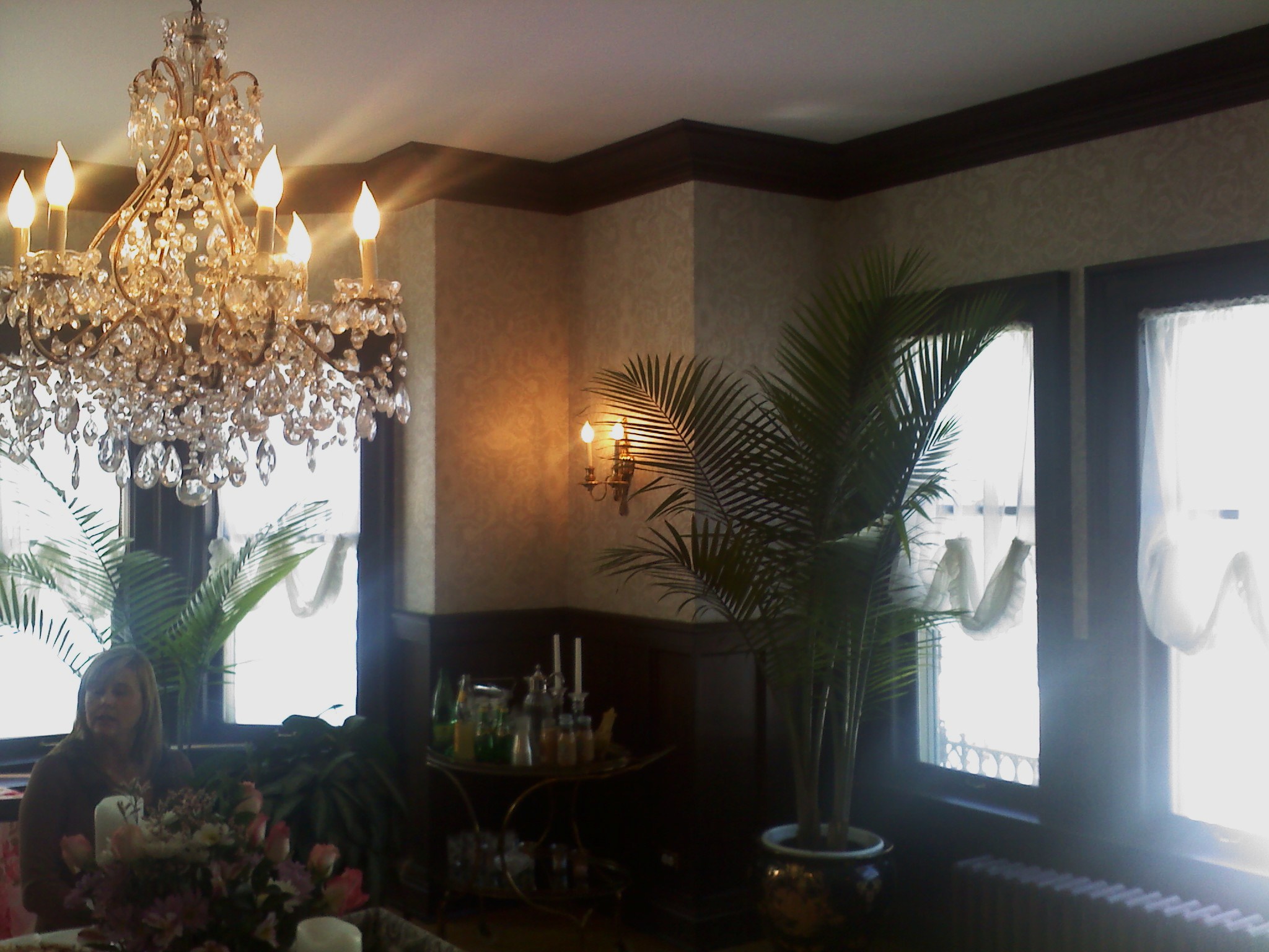
Hurdle #3 – Finding common ground between the owner’s vision, and my own.  This project is less, “go hog wild!” and more like a true design job…  walking the fine line between fulfilling the client’s wishes and staying true to your vision.  Janet has wonderful taste, but it’s very different from mine.  She loves pastels, ultra feminine interiors, and Victorian French opulence.  Je love all that too, but I prefer it pared down, injected with some modern oomph, a few punchy colors, and a little whimsy.  (Below Left) is Janet’s current living room.  (Below Right) was my living room in Charleston.

…And our respective dining rooms.  (Top) = Janet’s, (bottom) = mine:

Her style is more refined; mine is more laid back and eclectic.  If Janet was an issue of Veranda, I would be the love child of Cottage Living (RIP) + Domino mag (RIP).  Classical music plays softly in her house, while Def Leppard and Billie Holiday mash-ups blare in mine.  You get the idea.  We do, however, share a love of antiques and all things French.  So I’m building on that.

Hurdle #4 – Getting ehhhhhverything DONATED.  Mama doesn’t have an extra $10k lying around to spend on curtain tassels.  Luckily, I’ve worked as a design rep long enough that several dear friends and clients have offered to lend some of their gorgeous inventory to the showhouse.  (High-five Devin & Don from Jayson Home and Garden, George from George Lowell, Ken from Kenneth Ludwig Home Furnishings, Christopher from Urbanest, and Brian & Rob from Oscar Isberian!  Hollar.)

Hurdle #5 – Coordinating all the yesses, no’s, maybes, and “come back and see what we have in stock the week before”‘s, and turning that into something that resembles a cohesive design plan.  I would do cartwheels if I could just bop around Chicago and hand-pick what I wanted.  That said, here’s what it’s looking like so far:

Left to right, top to bottom:  (a) Farrow & Ball’s PALE POWDER = Wall Color.  (b) Chandelier from Kenneth Ludwig Home Furnishings.  (c) “Contessa” fabric, by Home Couture for Quadrille, available to the trade through Summer Hill.  This pattern – used by the likes of Ruthie Sommers and Angie Hranowsky – has had me messing myself for YEARS. (d) Antique Moroccan marble lamp base, from Edgewater Antique Mall.  (e) Rug from Oscar Isberian.  (f) Mirror from Kenneth Ludwig Home Furnishings.  (e) Shades by Delia Shades.  I first saw these in a bathroom done by one of my idols, Jessica Helgerson.  These are FLAW-LESS.  Simple, clean, and lovely.  They also filter out only 14% of the light, so they’re relatively transparent.  (f) Spencer Chair, from Jayson Home & Garden.

Nothing is set in stone, but that’s how it’s shaping up.  My biggest challenge is to keep it looking fresh…  I’m still looking to add a dose of lucite, some limewashed-looking wood, and another pop of color somewhere.  The showhouse runs from June 18 – July 2.  We would LOVE for you to stop by!  I’ll also be teaching a workshop on refinishing furniture that week.  Check out the project’s website for further information.

XOXO

Goodwill Hunting

I have a deep, deep love of thrift joints, flea markets, estate sales and garage sales…  a penchant that is surely the result of me & my cousin, Jill, being dragged kicking and screaming through antique stores as kids (“but ehhhhhhh, we wanna go to the beeeeeaacchh-uh!”) on family vacations to Florida.  Jill & I were also along for the ride on “junkin’” trips with the she-elders in our family.  We’d zip around in my Nanny’s two-toned Buick to every thrift store within a 20-mile radius of her Florida retirement compound, while she and our aunts smoked, cackled and told jokes in the front seat.  Our great-grandmother, “GG”, a sweet-looking 4’9” woman who weighed 75 pounds soaking wet, would often come along too, and take an occasional break from giggling and spitting in her snuff cup to yell, “SLUT!” at anyone who cut us off in traffic.  In any case, when we couldn’t beat ’em, we joined ’em, and junkin’ became a beloved family tradition.  Jill and I learned to love trips to these dusty, occasionally stinky places brimming with treasures.           


To this day, I will veer off the road for any good antique store or junk store.  It’s something about the thrill of the hunt… of finding something unique buried in a heap, patiently waiting to be dusted off and brought back to life.   I realize there’s a certain aversion to these establishments…  the mothballs, the dirty floors, etc.  And no, I don’t actually think people pee on the floor in there.  I promise, there are diamonds in the rough – you just gotta start sifting.  For example: I found this light at the Old 67 Antique Mall in Muncie, IN, for a whopping $8.  I showed it to my dad, who made an awful face generally reserved for congealed food and my dog’s gas:            

Granted; the before pic is crusty, but check out the after (!!!)  I took the light apart, wiped it down with Windex, painted the metal parts with a coral paint sample I had lying around, and sewed a little sleeve out of a linen remnant to hide the ugly cord.  The ceiling medallion was under $10 at Home Depot.  Voila!  A new bathroom chandelier for less than $20.  BANG.           

Alright, recessionistas.  Below are some ideas on what to be on the lookout for when you venture out into the junkin’ universe…  armed with hand sanitizer.            

LOOK FOR –> MISMATCHED FRAMES           

                         (via House Beautiful)           

In college, I decided to do a huge collection of framed black & white family photos.  I rifled through family photo albums, then scanned and printed 30 of my favorite pictures in various sizes.  Spending $20 per frame at Pottery Barn on my food stamp college budget wouldn’t work, so I trekked to my local Goodwill and scooped up a ton of mismatched frames for about $0.50 cents each (hint: look for irregular sizes to throw in the mix – square, oblong, etc, so you’re not stuck with a snore of 5×7’s and 8×10’s).  Lay out some newspaper on the garage floor, take the glass outta the frames, and spray paint those bad boys the color of your choice.  Scoop up mats from Wal-Mart or Michael’s.  Put ’em together, hang ’em up, and your work is done!  Instant focal point.  And the best thing is, you can build on the collection forever.  And ever.           

My current bedroom, with my now expanded collection.  Please exsqueeze the crooked ones…           


My college bestie Mary’s living room in St. Louis.  We recently christened it with a wall of Goodwill frames while I was visiting:   


Hey, nobody said you had to do all black and white.  Use all mismatched frames if you like:           

(via Domino)           

LOOK FOR –> DINING ROOM CHAIRS            

Getting a new place?  Need to punch up a boring table?  Grab a couple of mismatched chairs like this one I ran across for $5 bucks:           


When you’re dealing with mismatched items like this, unify them by painting them the same color, or upholstering all the seats in the same fabric.  This way, they look like a set…  but with some character.  SJP even gave it a whirl in her house in the Hamptons!           


Or, for a really good time, I’d bang ’em out in THIS fun coral color, with crisp white upholstered seats:            

Rules of thumb when choosing chairs:            

1.  Don’t spend more than $10 or $15 on each one.   The chair above was $5.           

2.  Make sure chairs are sturdy and comfortable.  Sit it in, lean back, wiggle around.  If the seat is upholstered, make sure the upholstery isn’t shot or totally deflated.  Furthermore, if you’re re-upholstering, flip the chair over and see if the seat is screwed into the frame of the chair.  If it is, this means it can be easily unscrewed…  then you can just wrap the new fabric around the existing seat, secure with a staple gun, and screw back on.  BAM.  If the seat is NOT screwed into the frame and looks like this…  …consider that this will be a bit more work, as you’ll have to sew the new guy on.           

3.  Try to make sure chairs are relatively the same size / scale.  You don’t want a Smurfy chair perched next to King Kong’s chair.  Or, maybe you do.  It’s your party.           

LOOK FOR –> MISMATCHED DINNERWARE           

For anyone who hasn’t seen “It’s Complicated” yet, do yourself a favor and see it.  The decor inspiration alone is well-worth your $4 rental bucks.  I’ll gush on Nancy Meyers’ flicks in a later post, but in this movie in particular, Meryl Streep’s kitchen is to DIE for, in a warm, cozy, utilitarian, So Cal farmhouse kind of way.  If you look closely at the open shelving on the left, she’s got oodles and oodles of piles of mismatched white dishes.  Ah, the unpretentious simplicity.           


At an average of $0.25 cents a pop, you can throw together a pretty swell collection of mismatched white dishes for a song.  There are GOBS of them everywhere you look at every junk store.  And since you’re operating in a monochromatic palette, look for pieces with texture to add visual interest and keep the collection from looking bland, like these:      


Or, if you feel like mixing and matching in another color, or colors (think Anthropologie), that works too.  Country blue is not really my thang (nor is that skanky pink nail polish I’m wearing), but it runs rampant in rural Indiana:        

That’s enough for y’all to chew on for now, right?  “Goodwill Hunting” will appear as a recurring post, because I have COPIOUS amounts of other tricks to share and fun things to scout for.  But the moral of the story is, if you’re willing to roll up your sleeves and use a little imagination and elbow grease, I bet you’ll be surprised at the goodies that lie beneath the heap.  Bonus (!)  You’ll have a piece in your house that has a story behind it, and that means something to you because you had a hand in creating it.  Double Bonus (!)  You’ll have some extra play money for a rainy day.